Key takeaways
- Productivity measures how efficiently useful output is created; activity measures motion and can increase while performance falls.
- Fair dashboards combine outcomes with work difficulty, quality, capacity, blockers, dependencies, and trend evidence.
- The best management response may be coaching, recognition, workload protection, process repair, or constraint elevation, and the dashboard must help distinguish them.
Performance and productivity dashboards are dangerous when they make weak management feel scientific. Count enough emails, meetings, tasks, calls, or hours and every person receives a number. The interface looks objective. The number may still reward visible motion, punish difficult work, and hide the system conditions leadership created.
Executives do need faster performance visibility. A department leader should be able to identify unusually strong or weak execution signals without waiting for a quarterly review. A CRO should see who moves revenue and who needs support. A COO should see where workload and waiting are degrading flow. Speed is valuable, but only when the evidence preserves context.
A useful productivity performance dashboard therefore starts from output and business contribution. It connects results to the actual work, then checks quality, priority, capacity, blocked time, dependencies, and constraints. The purpose is not to watch people more closely. It is to help managers make better decisions sooner.
Performance, productivity, and activity are different#
Performance describes the degree to which a person, team, or system achieves an expected outcome. Productivity describes useful output relative to the resources and time consumed. Activity describes actions taken. These ideas overlap, but treating them as interchangeable produces bad incentives.
A seller can log high activity while qualified pipeline remains unchanged. An engineer can close many small tasks while one critical review queue delays the release. A project manager can keep everyone utilized while too much work in progress increases cycle time. In each case, activity rises while system performance weakens.
The dashboard should label these layers. Outcomes show the result. Output measures show finished value. Activity helps explain behavior. Capacity and flow explain the operating environment. No single layer should become a complete judgment.
| Measure | What it tells leadership | Common misuse |
|---|---|---|
| Outcome | Whether the expected business result moved | Attributing the whole result to one person without context |
| Useful output | What valuable work was completed | Counting unlike work as equivalent units |
| Activity | Which actions were attempted | Treating motion as contribution |
| Quality | Whether output met the required standard | Ignoring rework or downstream cost |
| Flow | How work moved through waiting and active states | Blaming an owner for system delay |
| Capacity | Whether demand exceeded available attention | Rewarding permanent overload as commitment |
Why task counts create false productivity#
Task counts are attractive because they are easy to calculate. They are also easy to game and easy to misread. Ten routine updates are not necessarily more valuable than one difficult dependency resolved. A completed task may create customer value, remove risk, or simply tidy a board. The count cannot tell the difference.
Raw volume also changes behavior. People split work into smaller items, avoid ambiguous assignments, and prioritize what can be closed quickly. Managers receive cleaner charts while strategic work waits. The dashboard has optimized the representation of productivity rather than productivity itself.
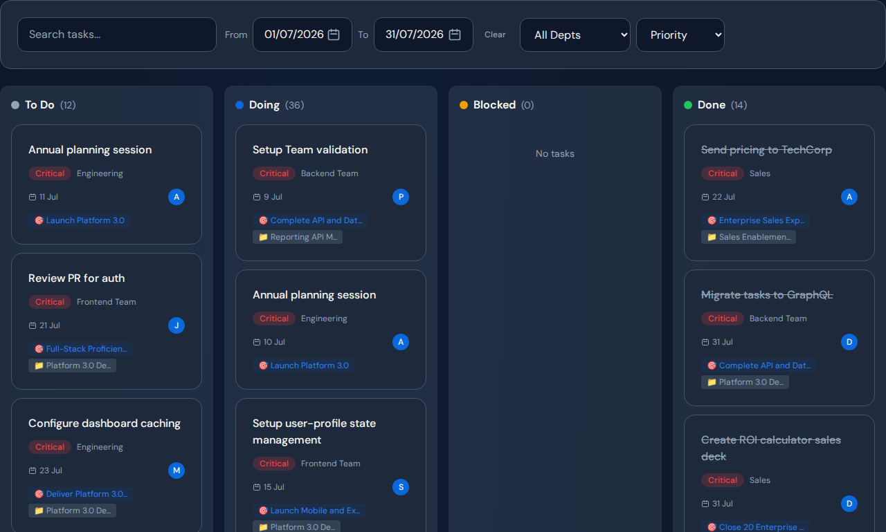
Task evidence still matters. Use it beneath the performance signal. Include priority, linked goal, project, due date, blocked state, owner, and completion history. That context lets a manager understand what was finished and why it mattered.
When a metric becomes a target without context, people learn to improve the metric before they improve the business.
Build a fair team productivity model#
Fair does not mean avoiding comparison. It means comparing evidence that deserves comparison. Start with role expectations and the outcomes assigned to the role. Then inspect work volume, difficulty, priority, quality, blocked time, dependencies, and trend. Compare similar periods and similar responsibilities.
A weak month can be a coaching signal, a capacity signal, or a system signal. If assigned work was clear, comparable, unblocked, and repeatedly unfinished, coaching may be appropriate. If one person inherited the oldest blocked items or every difficult approval, the operating design may be the issue. The dashboard should make both explanations visible.
High performance deserves the same care. A top contributor may have a repeatable method the team can learn. They may also be carrying invisible coordination work or becoming a bottleneck because every difficult decision routes through them. Recognition and system protection can be required at the same time.
Comparable, unblocked work repeatedly misses the expected standard.
Demand, active WIP, or dependency load exceeds realistic attention.
A repeated queue limits the outcome for the wider system.
Connect individual output to the company goal#
Productivity loses meaning when it is disconnected from purpose. A team can complete a large amount of work that does not advance the current company goal. A dashboard must show which projects, tasks, deals, and actions contribute to the result leadership has chosen to protect.
Goal linkage changes the management conversation. Instead of asking who completed the most, leaders can ask who moved the highest-value work, which assignments remain blocked, and whether capacity is being consumed by lower-priority demand. This does not make every contribution directly comparable, but it makes priority explicit.
Commandix connects strategic goals to projects, weighted work, owners, departments, revenue, and constraints. That execution graph lets managers evaluate contribution without reducing people to isolated scores.
Use workload and flow before judging the person#
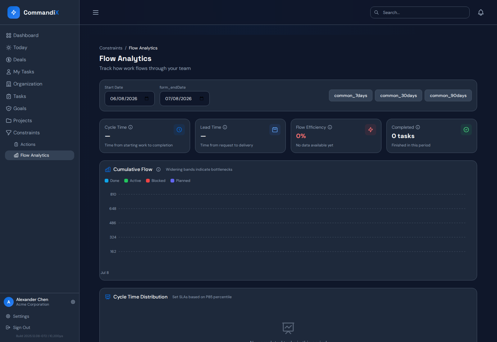
Workload is context, not an excuse and not a verdict. Active work, queue depth, blocked items, and dependency waiting show the environment in which output occurred. Flow metrics such as cycle time, lead time, aging WIP, and flow efficiency show whether the system allowed work to progress.
Suppose one team member completes less than peers. If that person also owns the highest-priority assignments, carries the oldest dependency queue, and spends most elapsed time waiting for external decisions, a completion ranking is incomplete. Suppose another person carries comparable work with low blocked time and repeated misses. That pattern supports a different intervention.
The purpose of the dashboard is to reach this distinction quickly. Leaders should be able to open the team signal, inspect the work, compare load and flow, and decide whether to coach, reassign, unblock, or protect capacity.
Measure sales productivity through revenue execution#
Sales exposes the weakness of activity metrics clearly. Calls and emails matter, but only as part of a revenue motion. A useful dashboard connects seller activity to qualified opportunities, stage movement, weighted value, won revenue, overdue next steps, and internal dependencies.
This helps a CRO identify who drives the most and least sales without stopping at the leaderboard. Territory quality, deal allocation, stage age, proposal support, and unfinished deal tasks provide the operating context. The leader can recognize repeatable behavior, coach weak follow-through, or remove an internal bottleneck slowing several sellers.
Commandix keeps deals, owners, sales tasks, unit performance, and company constraints in one operating system. Revenue performance becomes a management workflow instead of a monthly number.
Protect privacy and avoid surveillance design#
Performance data should serve a legitimate management purpose. Collect only the evidence required to understand outcomes and work. Publish definitions. Limit access by role. Retain enough history for fair trend analysis, but do not create a culture of continuous observation for its own sake.
The interface should reinforce that standard. Avoid public shaming, unexplained composite scores, and alerts that declare a person deficient without showing context. Use person-level signals as an invitation to inspect and discuss. Keep correction paths available when source data is incomplete.
Enterprise controls matter because these dashboards combine sensitive employee, strategy, project, and revenue information. Tenant isolation, role-based access, secure sessions, audit logs, and privacy documentation should be evaluated as core product behavior.
Use the dashboard to decide where to look. Use evidence, context, and a human conversation to decide what the signal means.
Run a monthly performance review that improves the system#
Begin with the business outcome and team expectation. Review changed signals rather than every metric. Identify unusually strong or weak patterns. Drill into representative work, then check workload, blockers, dependencies, quality, and trend. Name the management response and the evidence supporting it.
The response should fit the diagnosis. Coach a behavior when expectations and conditions were clear. Recognize and teach a repeatable high-performer method. Reassign work when role fit is wrong. Protect an overloaded owner when the system depends on that capacity. Change a process when repeated waiting affects several people.
At the next review, measure whether the intervention improved useful output, quality, flow, or the affected goal. Performance management becomes credible when the company checks its own management actions, not only employee results.
Evidence before action
- Confirm the role expectation and outcome being evaluated.
- Compare similar work and a meaningful time period.
- Inspect priority, difficulty, quality, and goal contribution.
- Check active workload, blocked time, dependencies, and queue age.
- Distinguish a one-period anomaly from a repeated pattern.
- Choose coaching, recognition, reassignment, unblocking, or capacity action.
- Review whether the intervention improved the expected result.
Choose metrics that improve behavior#
A metric belongs on the dashboard when it supports a specific management decision and encourages the behavior the company wants. Completion may support delivery coaching. Aging WIP may support escalation. Goal contribution may support priority. Quality or rework may protect the customer result. No metric should remain simply because data is available.
Use a balanced set rather than a synthetic score that hides assumptions. Executives should be able to see the outcome, output, quality, flow, and capacity components separately. Managers can then explain why a person or team appears strong or weak.
Review the model quarterly. Remove measures that never change action. Check for gaming and unintended consequences. Ask employees whether the dashboard reflects the work accurately. Measurement is part of the operating system and must be managed like one.
Turn productivity visibility into better management#
Performance and productivity dashboards create value when they replace vague judgment with evidence and replace simplistic judgment with context. That requires more than a ranking. The system must connect outcomes, work, quality, capacity, flow, constraints, and trends.
The team performance dashboard guide explains the high-performer and low-performer drill-down in detail. The performance management dashboard solutions guide provides a broader buyer framework for selecting the underlying platform.
Commandix gives leaders that connected path. Managers can identify the signal quickly, understand the operating system behind it, choose a fair action, and verify whether performance improved. The result is stronger accountability without confusing surveillance for leadership.
Explore team performance, task evidence, goals, revenue, flow, and constraint context in the live Commandix workspace.
Open live workspace
Frequently asked questions#
What is a performance and productivity dashboard?#
It is a management view that combines business outcomes, useful completed work, quality, activity, workload, flow, blockers, and constraints so leaders can understand performance in context.
Which productivity metrics should a team track?#
Track a balanced set such as useful completed work, quality or rework, cycle time, aging WIP, blocked time, goal contribution, and capacity. The right measures depend on the role and decision.
Can a dashboard fairly identify low performers?#
It can identify a signal for investigation. A fair decision also requires role expectations, comparable work, priority, difficulty, quality, workload, blockers, dependencies, trend, and manager judgment.
How can productivity dashboards avoid surveillance?#
Collect only decision-relevant evidence, publish definitions, limit access, avoid unexplained composite scores, preserve context, and use signals to begin a human review rather than automate a verdict.